Hello all,
Recently I have been getting into making my character profiles more pretty and organized by adding images I have drawn with blank backgrounds into areas with text. (For example, [ align=
Recently I have been getting into making my character profiles more pretty and organized by adding images I have drawn with blank backgrounds into areas with text. (For example, [ align=
[ img ] like here [ /img ][ /left ]then I have my text aligned right. This makes my picture sit on the left with text next to it. It looks snappy.
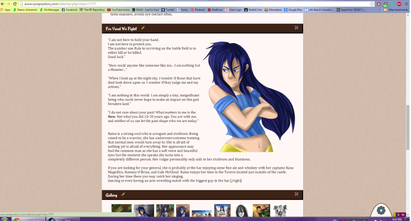
However, I have been coming across a problem lately that can cause me to rip out my hair-- but I am unsure if it is actually fixable. When I am in the 'edit characters profile' section of RPR I can see what their pages look like:

Looks great (Well, not as great as I like, but good enough because I am too lazy to edit the size of her picture anymore)
Anyways, what I am getting at is sometimes what I see on that page is not the same that I see on her actual page. When I am happy with what I see on the edit page I will update the profile and then go to the page-- only to see that... its not the same on the edit page? The text is all messed up and often scattered, but on the edit page everything fit so perfectly! So i usually spend a lot of time trying to fix the sizing of the image to make it sit properly (Usually the text ends up being all spaced strangely and look bad, but on her public seen page its perfect.)
I hope I made some sense there-- My thoughts for this happening is that the theme my character has manipulates how wide the text boxes are, etc, but on the edit page it doesn't have any limitations so it can do whatever it likes?
I was wondering if this is something that could ever be fixed one day, like more in depth designing of character pages (Maybe we could someday just grab a corner of our image and use it like a transform tool to get it the exact size we want it to fit with the text-- but I think I am asking for too much there) Or if I am just being too picky (I probably am). Or if I am just in general crazy, and this doesn't happen to anyone else.
However, I have been coming across a problem lately that can cause me to rip out my hair-- but I am unsure if it is actually fixable. When I am in the 'edit characters profile' section of RPR I can see what their pages look like:

Looks great (Well, not as great as I like, but good enough because I am too lazy to edit the size of her picture anymore)
Anyways, what I am getting at is sometimes what I see on that page is not the same that I see on her actual page. When I am happy with what I see on the edit page I will update the profile and then go to the page-- only to see that... its not the same on the edit page? The text is all messed up and often scattered, but on the edit page everything fit so perfectly! So i usually spend a lot of time trying to fix the sizing of the image to make it sit properly (Usually the text ends up being all spaced strangely and look bad, but on her public seen page its perfect.)
I hope I made some sense there-- My thoughts for this happening is that the theme my character has manipulates how wide the text boxes are, etc, but on the edit page it doesn't have any limitations so it can do whatever it likes?
I was wondering if this is something that could ever be fixed one day, like more in depth designing of character pages (Maybe we could someday just grab a corner of our image and use it like a transform tool to get it the exact size we want it to fit with the text-- but I think I am asking for too much there) Or if I am just being too picky (I probably am). Or if I am just in general crazy, and this doesn't happen to anyone else.
I've never had any trouble with this. I do notice that the editing page and actual page will look different, but that's to be expected so long as the editing page doesn't duplicate the design of the actual page (which could be a mess in development). What you're describing sounds more messed up, though, like it could be a bug.
It should be enough to have the image at the top and only "align" that. I did notice your BBCode example is messy, so you might be entering it wrong. You also don't have to use multiple tags - you can actually just put the align in the opening image tag, like:
Showing how you're entering the text could help, in case it's the way you're entering the BBCode that's causing the problem. And if you think it may indeed be a bug, I suggest including a shot of the weirdness you're getting in a bug report.
It should be enough to have the image at the top and only "align" that. I did notice your BBCode example is messy, so you might be entering it wrong. You also don't have to use multiple tags - you can actually just put the align in the opening image tag, like:
Code:
[img align=right]image-url[/img]
Showing how you're entering the text could help, in case it's the way you're entering the BBCode that's causing the problem. And if you think it may indeed be a bug, I suggest including a shot of the weirdness you're getting in a bug report.
They're not ever going to look identical, I fear. Different templates have different widths, font sizes, fonts, letter spacing and line-height -- that's sort of the point of templates, that they'll look quite different from one another. And indeed, what browser you are viewing with can have its own effect on display.
The editor section is a very "vanilla" representation of what your content is set up to look like, in a general sense. It is not meant to be pixel perfect. What template you use will change the public display quite drastically, from one template to the next.
However, the BBCode you posted was indeed wrong, so that might have something to do with it. Can you post an actual example?
The best way to get your profile looking right is to try something, save it, then refresh the actual profile before you finish everything and have it looking perfect in the editor. I generally always disregard what the editor shows me and check the profile itself every couple of edits and adjust what I see on the live profile. That's the only way to get it looking the way you want it. 
Yikes, it probably is a 'me' problem-- I typed what I originally did without thinking, and I see the problem I made. But I suppose I was more curious if my template was effecting it or not-- and that seems to be mostly correct. As for my BBC, this is what I currently have typed in for the image,
[ img align=right]http://i74.photobucket.com/albums/i255/reeno_alchemist/Raine%20folded%20armsfinal_zpswrgjlght.png[/img ]
I don't think it's a bug (Heck maybe there was no point in even making this topic! lol) I think It is me, getting lost in the text. Either way, I think I got the answer I was looking for anyhow, thanks for your comments c:
Sanne wrote:
The best way to get your profile looking right is to try something, save it, then refresh the actual profile before you finish everything and have it looking perfect in the editor. I generally always disregard what the editor shows me and check the profile itself every couple of edits and adjust what I see on the live profile. That's the only way to get it looking the way you want it. 
I do this with all my profiles, I keep refreshing the actual page until I am happy with what it shows
That one looks correct to me! 
With just a quick glance, I can say that the current template that character is using is on the skinny side, only 700px across. The editor is closer to 940px across. Add in font differences and font size differences, and you've got a big ol' recipe for line breaks happening in different places.
With just a quick glance, I can say that the current template that character is using is on the skinny side, only 700px across. The editor is closer to 940px across. Add in font differences and font size differences, and you've got a big ol' recipe for line breaks happening in different places.
Kim wrote:
That one looks correct to me! 
With just a quick glance, I can say that the current template that character is using is on the skinny side, only 700px across. The editor is closer to 940px across. Add in font differences and font size differences, and you've got a big ol' recipe for line breaks happening in different places.
With just a quick glance, I can say that the current template that character is using is on the skinny side, only 700px across. The editor is closer to 940px across. Add in font differences and font size differences, and you've got a big ol' recipe for line breaks happening in different places.
Makes sense to me! Thanks for convincing me that I am not insane-- haha. I was finding myself getting frustrated since the editor wasn't matching up with her actual page-- now everything makes sense so I will just keep disregarding the editor. Thanks for your time!
Glad to help confirm you aren't insane, at least! 
You are on: Forums » Suggestions & Development Discussion » Character Page Creation
Moderators: Mina, Keke, Cass, Claine, Sanne, Dragonfire, Ilmarinen, Darth_Angelus