bigger image
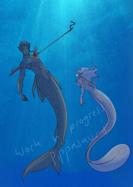
I need some advice pose wise on this drawing. Let me know what you think (female is much smaller than the male)
Is it working well or should i change up the females tail?
I'm a fan of how it is right now. The female looks further back to me though. I thought she was small because she was in the background more.
f0x1nth3b0x wrote:
I'm a fan of how it is right now. The female looks further back to me though. I thought she was small because she was in the background more.
Yeah that's what I was thinking I might try to overlap them a bit to show the distance to them a little better
thank you for your input
Pomkeki wrote:
The female does look a little bit like she's in the background. You could resolve this in a few different ways:
- Rotate her torso or her head to face the the viewer more.
- Cast a shadow on the male where the female is in relation to him.
- Overlap the two, her hand or her tail could be overlapping him in some way.
- Include some elements in the foreground and background to convey depth. You can make something look like it's receding into the background by keeping it simple/removing detail and adding some color from the background to "fade" it.
- Shading. This is unfinished so I'm sure once you work on them some more, the shading will help convey their positioning.
Apart from that, I think the poses are great and they read really well. The only change that I would make to the male is rotating his head to tilt up, away from the viewer and open his mouth. I feel like that would express an unconscious or dead state better. The way his head is right now makes me feel like the muscles in his neck are tensed/controlled instead of relaxed.
You mentioned her tail. I don't see anything wrong with the pose it's in, but if you are concerned, maybe add a few more 'flares' or fins to add some interest. They can also help emphasize the flow by showing which direction she's moving in, kind of like her hair.
Thank you so much this is exactly what I was looking for! I think I might go with overlapping them a bit maybe have her hand over him and her tail curled behind to kind of look like she is circling him, I like the idea with the fin flare a little more too.
With the background , Im thinking adding some coral or rocks for depth it was really rough at the moment
thank you for your input
This wasn't mentioned, but I would also recommend reducing the amount of blood from the entry wound. Since the spear/harpoon is still embedded inside him, I believe it would be stopping a lot of that blood loss.
Katia wrote:
This wasn't mentioned, but I would also recommend reducing the amount of blood from the entry wound. Since the spear/harpoon is still embedded inside him, I believe it would be stopping a lot of that blood loss.
There wasn't meant to be alot of blood but I was trying to draw it fading out into the water do you think I should make it more see through and spread out?
Perhaps that would be good, it's just as it is now, there seems to be too much blood in comparison to the harpoon point jutting out of him.
Katia wrote:
Perhaps that would be good, it's just as it is now, there seems to be too much blood in comparison to the harpoon point jutting out of him.
You are on: Forums » Art & Creativity » Input on this mermaid drawing.
Moderators: Mina, Keke, Cass, Claine, Sanne, Dragonfire, Ilmarinen, Darth_Angelus
