Posted by Kim on January 16, 2020, 10:00am
One of the massive updates that we got in 2.0 was the ability to organize character profiles with much more exactness, through columns and rows. This is an optional feature; you can still create character profiles more or less the same way you always have, by simply stacking your widgets one on top of the other. But if you want a little more control over the layout of your page, this is a great place to start.Let's take a look at how they work!
When editing a character, you'll find that widgets now live inside of columns. And columns are arranged in rows. You can have one column that takes up an entire row, or you can split a row into up to six columns.
To start breaking up your columns, find the "column shrink" button on one of your columns. It will look like this:
Click it, and your column will get smaller. Keep clicking it until there's enough room in the row for another column -- you'll know when that's happened, because a "Add another column" button will magically appear, like this:
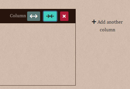
Click it to take it up on its offer, and you'll have two different columns in your row, side by side! You can now place one or more widgets in each of your columns, and they will display side by side as well.
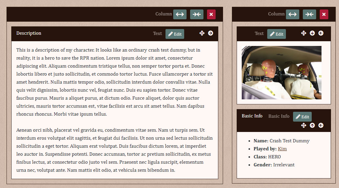
When viewed on a profile, it might look something like this:

You can either click and drag your widgets between different columns, or else use the left/right button to move widgets to different columns and even different rows. The up/down buttons will re-arrange widgets within their current column.
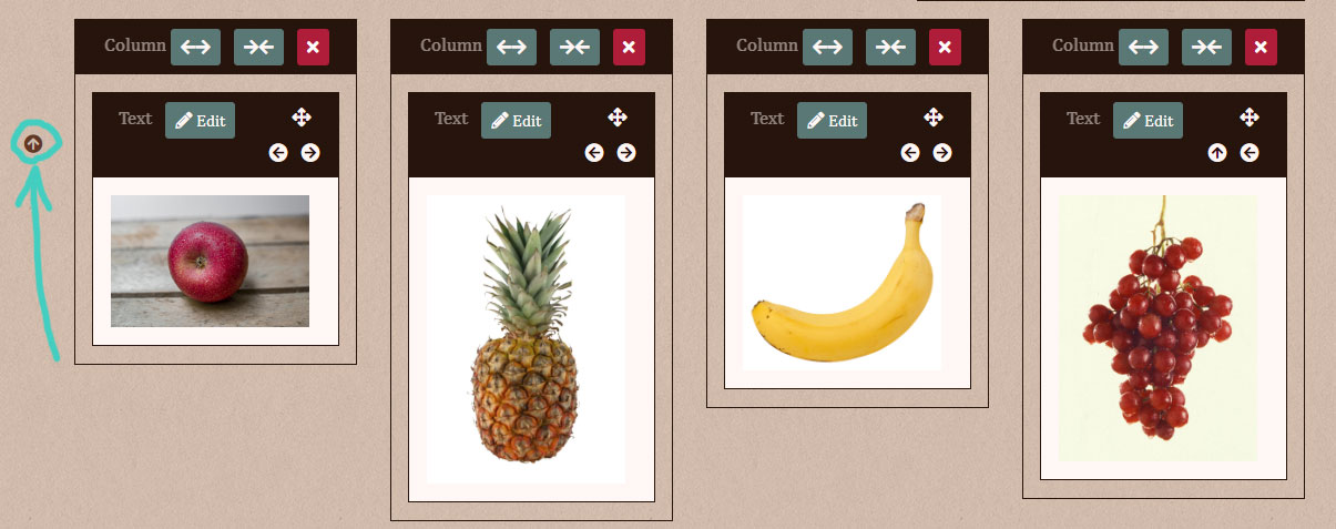
When you have multiple rows full of columns, you can use the up/down buttons on their side to swap the positions of entire rows.
Deleting columns
When you delete a column, the widgets that were inside it will not be automatically deleted. The widgets will all scramble to find another column to go live in, and if they can't find one, they will create a new one.
Deleting rows
Rows delete themselves when they no longer have any columns in them. However, you must always have at least one row on a profile.
What about on mobile?
Under a certain screen size, columns in both profiles and in the profile editor will stack themselves one on top of another just as before, so that mobile users won't have to scroll from side to side in order to see profile content.
Post tags: Feature Explanations
Next: Some New BBCode Capabilities »
« Previous: Feature Spotlight: Controlling Which Characters are Featured on Your Profile
Comments
I love this feature so much!!! Thanks, Kim! 
What really dazzled me was how responsive pages are now. Now I don't have to worry that the content overflows. The fact that rows now stack automatically is GOLD. It makes me so happy!
This is amazing. Great job Kim. Makes it easier for people now to make their profile look awesome
Warlocke
January 17, 2020
9:24pm