Posted by Kim on February 3, 2016, 2:30pm

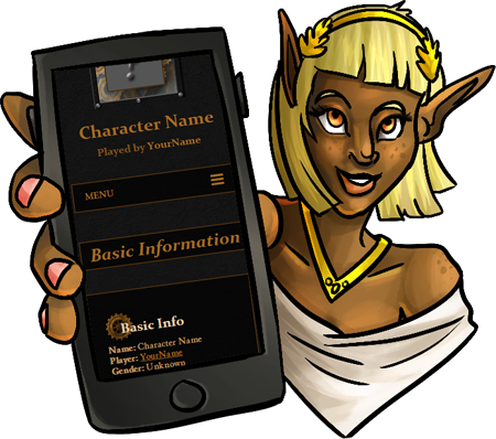
All 167 official templates have been updated, modernized, and finally support small screen devices!
Amazingly, only two templates had to be retired during this process: The scroll box versions of the orchid templates.
Amazingly, only two templates had to be retired during this process: The scroll box versions of the orchid templates.
If any of your characters were using a scroll box orchid template, they've been transitioned to using the non-scroll box version.
You may notice that some of your favorite templates look slightly different, whether it's a modified width or an easier to read text color. Every template has had multiple issues addressed, and been made more robust to stand up to all the wildly varying ways people set up their profiles, the different ways people try to view them, and the many things that used to go wrong along the way.
Now that our existing templates are up to snuff, you'll start to see new templates arriving again! (*cough* epic week *cough*)
As you know, with any major update there is a risk that new bugs have found their way in. Please help make our new templates flawless! If you run into trouble, big or small, please submit a bug report so I can fix it for you and everyone ASAP.
Edit: Please please please remember to include a link to where you're seeing the issue! Often, special circumstances of some kind are involved, and I need to see a real live malfunction to efficiently address it.
Comments
Yaaay! 
Adoring the new changes!!
How exciting!
Aw, sweet! I'll check out the mobile version when I get the chance! 
*vibrates excitedly at the mention of epic week*
@ Kim
Yup works now it just took a few hours for my phone to catch up I guess lol
Yup works now it just took a few hours for my phone to catch up I guess lol
Yaaaaaaaaay! I am SO HAPPY that this finally happened!
@Kitom - I see! I think that was patched a little earlier, give it a few refreshes. 
@Profane - You have the old boxes cached. Give that page a refresh, please. 

The templates have outgrown their old boxes.
@Reima - Link please! 
The character image in 'Treasure Map' overlaps the character name I think
These are going to take some time to get used to xD Not bad though, now I can read
These are going to take some time to get used to xD Not bad though, now I can read
Fixed, thank you! 
I was going through my characters and I came across some things. No idea if its just the new template layout or just my formatting on letters due to being a mobile user. But Template Runelore (gold) is enlongated width wise and Template:Orion Nebula on the widgets are now rounded and cut into pictures and videos.
Again, might be just the new template or me as a mobile user but just wanted to give you a heads up.
Again, might be just the new template or me as a mobile user but just wanted to give you a heads up.
thunderous applause
Well done, well done!
Well done, well done!
Added picture so I don't feel like I'm talking nonsensicaly lol
[img]http://imgur.com/84tyvTu[/img]
Yay, as a mobile user on the go this is great! I've been meaning to update my characters but stayed away from the mobile all together. But this has defiantly made it ten times easier for me to do what I want to without having to touch a mouse. Thank you. 
@Kim
Yes I went through all my pages as well as a few friends and noticed in BBC columns are placed next to one another it kinda makes the background tweak a little but nothing that makes things unreadable or anything of the sort! Not even a complaint just thought I'd let you know
Yes I went through all my pages as well as a few friends and noticed in BBC columns are placed next to one another it kinda makes the background tweak a little but nothing that makes things unreadable or anything of the sort! Not even a complaint just thought I'd let you know
Yay! Thank you so much, Kim -- as an avid mobile user, I'm very glad to see visual and navigational improvements on character templates. Thank you! 
TheGreySentinel
February 5, 2016
3:51pm