Posted by Claine May 14th 2023, 12:15pm
A little tutorial to explain how I colour my webcomics. Firstly, I suggest you watch How I Color Comics with CLIP STUDIO PAINT by Color with Kurt. I watched this when I was still fresh into the Webcomic. This video is aimed at people in the traditional comics industry. For example, it assumes that the flatter will be a different person to the colourist. Webcomics are almost always a one-person show, and with my workload, doing it fast is almost always a higher priority than doing it perfectly. The alterations in my methodology make things quicker but less perfect.
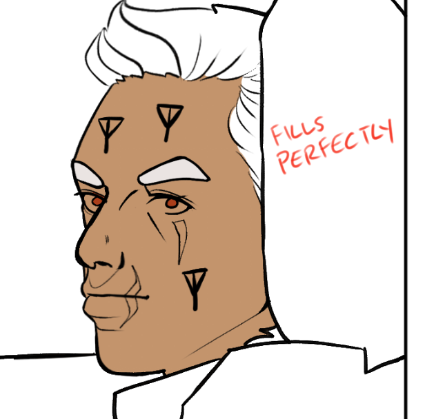
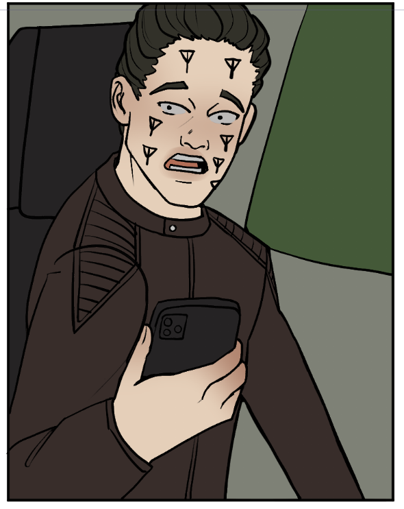
Once I finish my linework, I use the Close and Fill Tool without Gaps tool to flat my work. This method is far less precise than the lasso tool utilised by Kurt in his tutorial.

As you can see, it creates all these little tendrils of colour under the linework. This might be bothersome for professional production, but I flat about three times faster with this tool than any other method, so I'm willing to tolerate them. I did have to swap from using a favoured semi-opaque brush for my lines to a heavier one because these tendrils were very apparent in the final product.
Select a colour and lasso your first section.
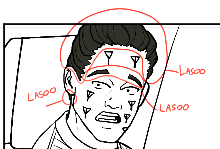
At this point, look to find another area of colour that does not touch your first and lasoo that too.
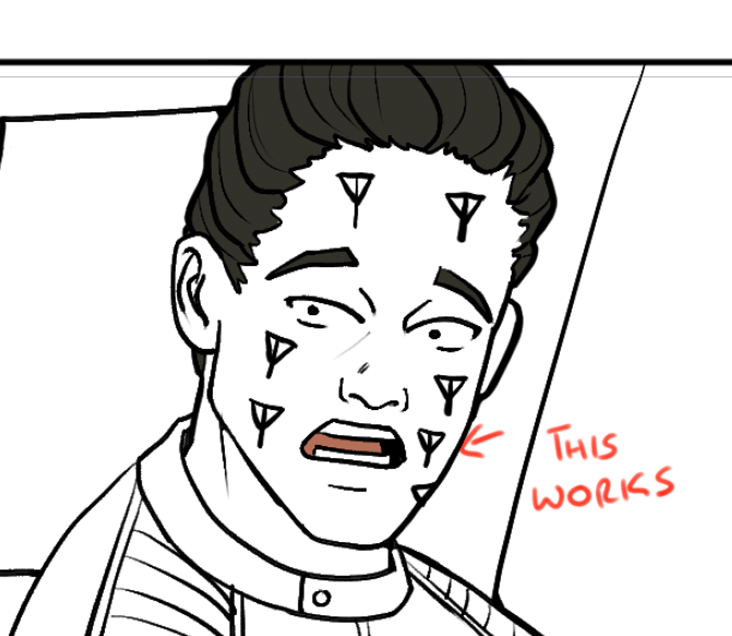
If the colours touch, your fill tool will not work as intended.
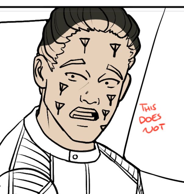
Once you have filled in as much as you want, create a second layer below and repeat the process.
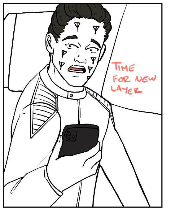
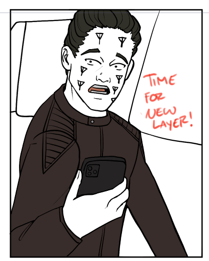
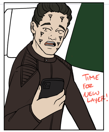
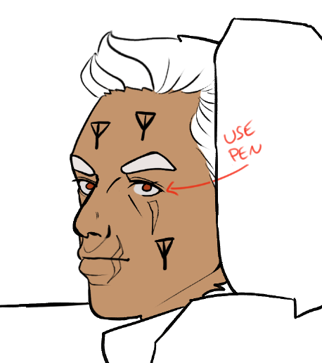
If the lineart is not closed, I draw a barrier with a hard pen in the intended colour, and then it lassos as expected.
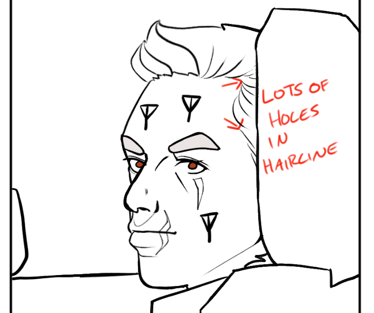
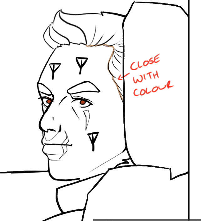
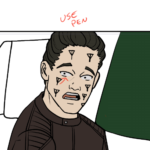
I usually fill in minor details (like the whites of the eyes) with the pen tool too.
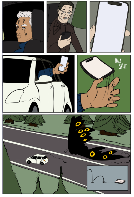
Once I have completed the page, I merge all the flat colours into a single layer.
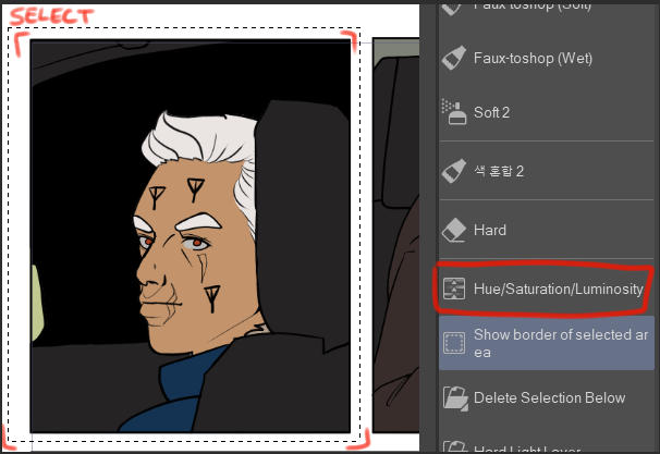
Next, duplicate your flat layer panel. Select the first panel, select Hue/Saturation/Luminosity and choose a random number. (I have Hue/Saturation/Luminosity on my quick select menu but you can find it in Edit - Tonal Correction -> Hue/Saturation/Luminosity)
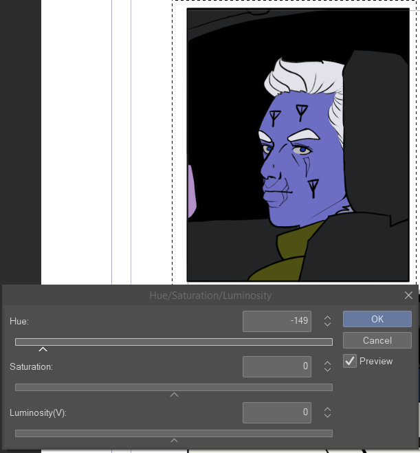
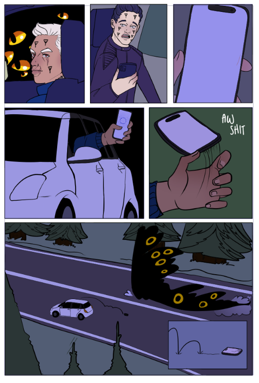
Repeat this for all panels, picking different numbers. If your panels are all very dark (setting scenes in pine forests at night, my beloved), upping the saturation and luminosity also helps. This is less precise than Kurt's method, as there can still be like colours between panels, but it's significantly quicker.
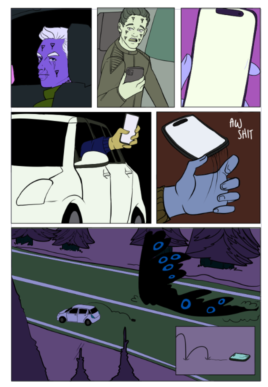
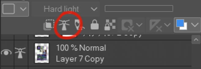
Set this new layer as reference. Then move it below the 'correct' flats layer.
Create a new layer on 'normal' mode and put it above your flats layer. You can use this layer for details. I put blush and lips on every character, but other details such as clothing patterns, scars, and grass texture can go on this layer.
Select the area of your flats layer. Create a new Hard Light layer, and using your selection, fill the panels with colour to give them an 'atmosphere'.

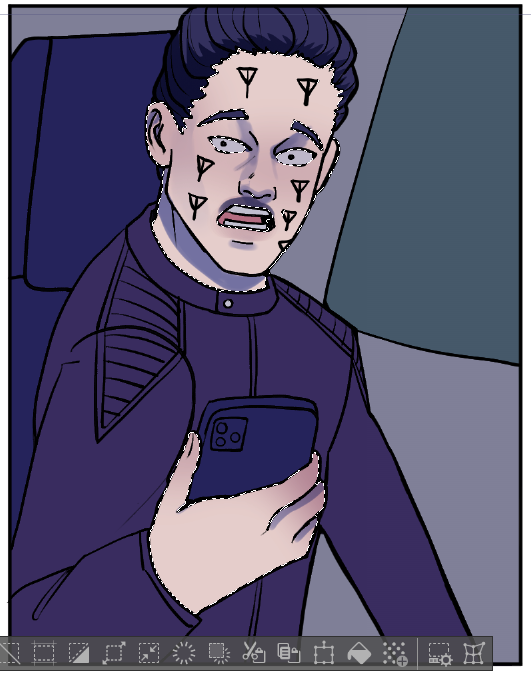
Create a new hard light layer and use the magic wand tool set to 'reference layer' colour the shading of your piece. If you don't like your selected colour, you can modify it with the hue/saturation/luminosity menu.

Repeat for all sections
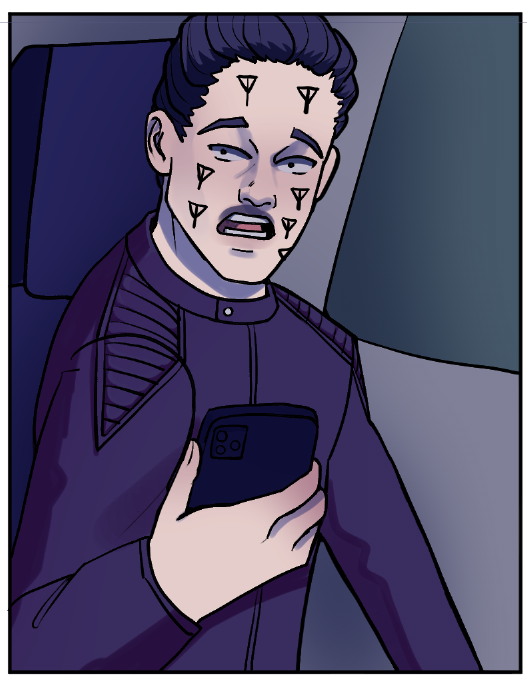
I use the Faux-toshop brushes in Frenden's Clip Studio Brush Pack. Soft brushes don't work well with the next step for my method, so I recommend a fairly 'dense' brush. Other than that, whatever brush you prefer should work fine!
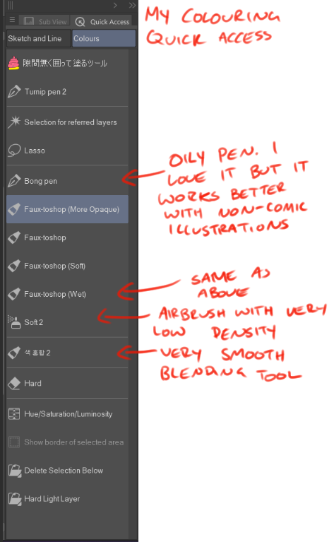
Create another hard light layer. Select the area you want to apply highlights with the magic wand. As a general rule, highlights and shadows are never going to be in the same place - shadow = no light. No light = no highlights. (of course there are exceptions like bounce lighting, but I tend to not worry about that when I'm doing a page). To avoid drawing highlights on top of your shadow, you should first select your area with your magic wand (set to use referred layers mode) then remove the selection of your shadows layer. This can be done by right-clicking the shadow layer, selecting "Selection from Layer", then "Delete Selection", and then returning to your highlight layer. But faffing around in menus 100 times per page and often forgetting to remember to return to the correct layer was tedious, so I created an auto-action to do the job for me. I have uploaded it to the Clip Studio Asset Store if you want to download it!
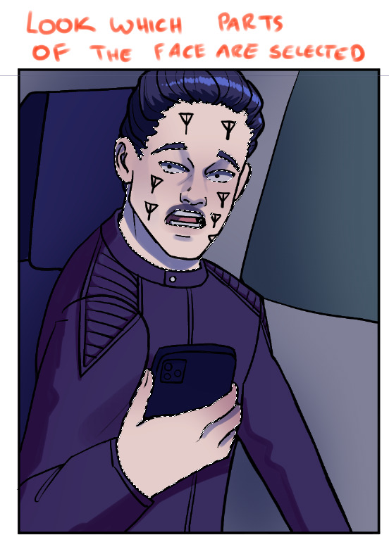
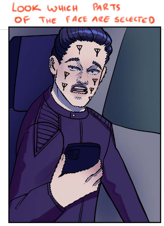
If your shading has a lot of transparency, deleting the selection may not work, but you can slap the auto-action button multiple times. This is the reason I prefer to use a very opaque pen for the shadows. However, you won't ever need to use the auto-action again from this point, so you can use soft brushes in your highlights if you please!
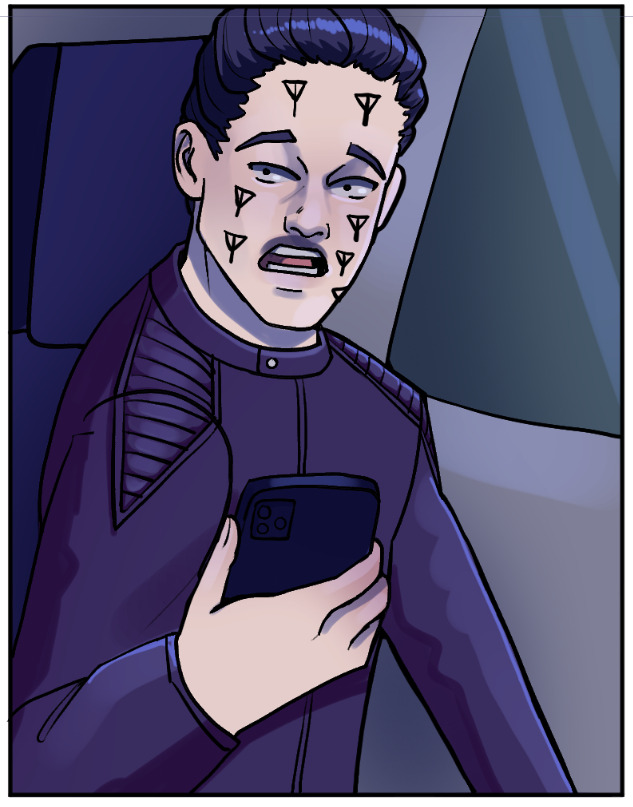
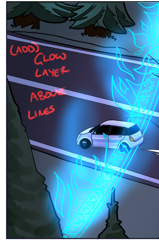
And finally - small details. If there are any glowing effects, I do them above the lineart layer. I go through all the layer types until I find one I like ;;;
And that's it!
If you have any questions feel free to ask.
Once I finish my linework, I use the Close and Fill Tool without Gaps tool to flat my work. This method is far less precise than the lasso tool utilised by Kurt in his tutorial.

As you can see, it creates all these little tendrils of colour under the linework. This might be bothersome for professional production, but I flat about three times faster with this tool than any other method, so I'm willing to tolerate them. I did have to swap from using a favoured semi-opaque brush for my lines to a heavier one because these tendrils were very apparent in the final product.
Select a colour and lasso your first section.

At this point, look to find another area of colour that does not touch your first and lasoo that too.

If the colours touch, your fill tool will not work as intended.

Once you have filled in as much as you want, create a second layer below and repeat the process.


If the lineart is not closed, I draw a barrier with a hard pen in the intended colour, and then it lassos as expected.


I usually fill in minor details (like the whites of the eyes) with the pen tool too.


Once I have completed the page, I merge all the flat colours into a single layer.
Next, duplicate your flat layer panel. Select the first panel, select Hue/Saturation/Luminosity and choose a random number. (I have Hue/Saturation/Luminosity on my quick select menu but you can find it in Edit - Tonal Correction -> Hue/Saturation/Luminosity)


Repeat this for all panels, picking different numbers. If your panels are all very dark (setting scenes in pine forests at night, my beloved), upping the saturation and luminosity also helps. This is less precise than Kurt's method, as there can still be like colours between panels, but it's significantly quicker.

Set this new layer as reference. Then move it below the 'correct' flats layer.

Create a new layer on 'normal' mode and put it above your flats layer. You can use this layer for details. I put blush and lips on every character, but other details such as clothing patterns, scars, and grass texture can go on this layer.

Select the area of your flats layer. Create a new Hard Light layer, and using your selection, fill the panels with colour to give them an 'atmosphere'.


Create a new hard light layer and use the magic wand tool set to 'reference layer' colour the shading of your piece. If you don't like your selected colour, you can modify it with the hue/saturation/luminosity menu.


Repeat for all sections

I use the Faux-toshop brushes in Frenden's Clip Studio Brush Pack. Soft brushes don't work well with the next step for my method, so I recommend a fairly 'dense' brush. Other than that, whatever brush you prefer should work fine!

Create another hard light layer. Select the area you want to apply highlights with the magic wand. As a general rule, highlights and shadows are never going to be in the same place - shadow = no light. No light = no highlights. (of course there are exceptions like bounce lighting, but I tend to not worry about that when I'm doing a page). To avoid drawing highlights on top of your shadow, you should first select your area with your magic wand (set to use referred layers mode) then remove the selection of your shadows layer. This can be done by right-clicking the shadow layer, selecting "Selection from Layer", then "Delete Selection", and then returning to your highlight layer. But faffing around in menus 100 times per page and often forgetting to remember to return to the correct layer was tedious, so I created an auto-action to do the job for me. I have uploaded it to the Clip Studio Asset Store if you want to download it!


If your shading has a lot of transparency, deleting the selection may not work, but you can slap the auto-action button multiple times. This is the reason I prefer to use a very opaque pen for the shadows. However, you won't ever need to use the auto-action again from this point, so you can use soft brushes in your highlights if you please!

And finally - small details. If there are any glowing effects, I do them above the lineart layer. I go through all the layer types until I find one I like ;;;

And that's it!
If you have any questions feel free to ask.
Community Feedback
- This is very informative! Thank you!
Commenting has been disabled.


Nicoise_ToastMay 16th 2023
12:41pm